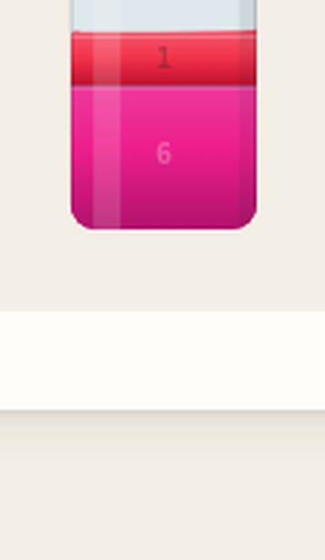
Red on top, magenta on the bottom
We built a liquid sort puzzle with a six-color palette that clears a CIEDE2000 accessibility gate, a test written in the language of print quality control because that is the discipline that takes human perception seriously. The gate passed. A player still asked which of the two closest colors was red. The answer did not come from the colors. It came from the physics.
The palette gate: 15 units of CIEDE2000 and still not enough
When we designed Clarify, we wrote a rule for the six liquid colors in the language of print quality control, because that is the discipline that takes human perception seriously and it is the only one that will tell you the truth about what a human actually sees when they look at a screen held in their hand at noon on a train. The rule has two parts. Every pair of rendered colors must differ by at least 15 units on the CIEDE2000 scale, a perceptual distance that is far more honest than the raw RGB gap most people reach for first because it is computed through the full Lab pipeline that accounts for the way human cones respond rather than the way a camera sensor does. On top of that, two colors that sit next to each other in the density order must be at least 30 degrees apart on the Lab hue wheel, or they must differ in lightness by 12 L-star units or more. The density order matters because adjacent hues are the ones that get confused when they are also close in brightness, and that is exactly the failure mode we are trying to prevent.
We put a test script in the repository. It converts each hex code through the full CIE Lab pipeline, computes deltaE00 for every pair, and checks the adjacent-hue rule. It runs in under a second. If it fails, the build is not done. It has failed twice already. Both times the fix was structural, not cosmetic.
The closest pair in the set is red and magenta, 30.1 degrees apart
The palette that shipped looks like this. Red is #F2334C. Yellow is #FFD60A. Green is #1FB854. Cyan is #10BFC4. Blue is #1E6FE5. Magenta is #EC1E8C. Now the numbers, which is where the story lives. In Lab space, red sits at a hue angle of 25.1 degrees with a lightness of 53.79 L-star units.
Magenta sits at a hue angle of 354.9 degrees with a lightness of 52.58, which means the shortest arc between the red and magenta hues on the Lab color wheel is 30.1 degrees, a gap that clears the 30-degree threshold by less than a single degree and would have failed the gate if we had rounded it down. The lightness gap between them is 1.21 L-star units, a difference so small that you need a spectrophotometer to feel it and a trained eye to notice it on a screen held at an angle in afternoon light. The CIEDE2000 score for the pair is 17.47, which clears the 15-unit gate, and it is the closest any pair in the whole set comes to the line.
If we had set the hue threshold to 35 degrees instead of 30, this pair would have been rejected, and we would have had to drop a sixth color or redesign the set from scratch, which is exactly what happened to our blue-indigo pair in the second palette and is the reason we are still living with a palette that has one deliberately tight gap.
The rest of the palette has wide gaps that make the budget work. Red to cyan is 175.5 degrees apart on the hue wheel. Green to magenta is 151.1. The wide gaps subsidize the tight one. That is how it works when you are packing six colors into a space that only has 360 degrees of hue to give away.
Where the confusion actually happens: inside a single bottle, stacked vertically
The gate is not a promise that players will never mix the two colors up. It is a promise about rendered rectangles. About side-by-side swatches in a legend or a picker under ideal lighting conditions. The real confusion happens inside a single bottle, where the two liquids stack vertically and the player must decide which layer to pour first, and that is a different problem entirely because vertical stacking changes both the luminance of each layer through the glass of the one above it and the spatial relationship that the eye uses to separate colors that are too close to tell apart at a glance.
Here is the part that surprised me, and it is why this article exists. Clarify uses its color IDs as its density ranks, and the IDs run from 1 through 6 with 1 being the lightest and 6 being the heaviest. The IDs are not just metadata in the data file. They are the physics. The Canonicalize function in core.js sorts every bottle's layers by descending density, and the density of a color is literally its own ID with no lookup table and no indirection. Red is ID 1. Magenta is ID 6.
So when both end up in the same bottle, the rules put magenta on the bottom and red on the top. Every single time. The reverse order does not exist in this game. It is not rare. It is impossible.
I wanted a number, so I wrote a probe across all 399 levels in the daily pool and counted every starting bottle that holds both colors together.
Thirty-nine of the 399 daily levels start with both red and magenta in at least one shared bottle. Across those boards there are 40 starting layers where the two colors sit mixed in a single tube. The probe checked the vertical order of every layer in every bottle on every board. Zero violations. Not one. The count stays at zero, and it will stay at zero, because the Canonicalize function throws an invariant error if a layer ever violates the density order, so the test is not finding a fact about the generated levels but rather a fact about the rules that generated them.
Physics as accessibility: the rules carry the information the color science could only promise
Clarify already had a reason to stack by density. The settling mechanic is the central twist of the game, and when liquid lands in a bottle the heavier colors sink and the lighter ones float, which is exactly what separates it from a stock liquid sort puzzle where anything can be poured onto anything and the player must remember which is which. We did not choose density ordering to help with the red-magenta problem. The red-magenta problem just happened to fall inside the territory the physics already owned, which is the kind of useful coincidence we try to make on purpose whenever we can.
That useful coincidence is also a form of accessibility that a color test can never guarantee, because the gate measures swatches in isolation and the game lives in bottles where colors layer and blend and disappear into the glass. A player who cannot tell the two liquids apart can still play correctly, because the game tells them the answer with structure instead of with pigment. The layer on top of the bottle is always the lighter one. You tap the bottle and the top layer lifts. Since red is always the lighter of the two, the player knows which liquid to move before they need to know which liquid it is by sight. The physics carries the information the color science could only promise to approximate.
This is the third time a color test has told us a palette is fine, and a gameplay mechanic has done the actual work of keeping players from getting lost.
Pebble Merge had a version of the same problem. Our first stone tiers were deltaE00 3.2 apart, which would fail any accessibility standard a designer would recognize, and we did not fix it by pushing the colors further apart. We fixed it by making the tiers different sizes, so the merge values, which happen to be triangular numbers, grow a visible step of stone with every level of the ladder and the eye reads the shape instead of the hue. The color is decoration. The structure is the signal.
Three palettes deep: pastels, rainbow, indigo, and the swap to green
The six colors you see today are the fourth version of the set. The first was a washed-out pastel range that looked confident in the mockup and disappeared on a phone screen held in direct sunlight, which taught us that pastels are a promise to the designer and a lie to the player. The second was a saturated rainbow, and it had its own near-pair. Color 5 was a pure blue at #054CF2 and color 6 was an indigo at #0C05E3, and a player told us the two were the same liquid until they read the numbers, which was a problem because both colors lived in the blue family and the deltaE00 between them was only 10.79, which failed the gate we had in place at the time and the two colors were only 7.9 degrees apart on the hue wheel.
The fix for indigo was direct. We replaced color 6 with green, which is hue-distant from blue and still satisfies every check in the test suite. The yellow and orange slots were harder to separate, because pushing yellow toward red and orange toward yellow would have compressed the gap against the existing red at ID 1, and the final arrangement put red at ID 1 and magenta at ID 6 with the tightest pair in the set being the one we knew we could afford. The density rules were already going to keep them apart, so the palette could spend its hue budget elsewhere, which was a lesson worth learning the hard way.
What we keep, and what we stop believing about the test that passed
We keep the test palette script because it is cheap insurance against a mistake that looks fine in the design file and disappears on a device we did not hold while we designed it. It is not a complete model of perception. It does not know what the colors look like inside a glass bottle with a meniscus and a specular highlight catching the light. It does not know what two liquids look like when they stack in a narrow tube on a screen held at an angle in the afternoon sun, and those are the conditions the player is actually in when they make the pour that decides whether the level solves itself or strands a color for the rest of the game.
The thing that does know those conditions is the rules engine, not the color test. The density order is a constraint shared by the renderer and the logic, and it is stricter than the color gate because it is enforced by the same code path that handles the pour rather than by a separate script that runs at build time and never sees the screen again. If red ever appeared below magenta, the Canonicalize function would throw an invariant error during the move, and the game would break the same way it breaks on an impossible pour, which is why the accessibility guarantee does not live in the palette but in the rule that the palette obeys and that the player experiences on every single turn.
The useful takeaway is narrower than it first looks. A color gate is a good way to keep a palette from embarrassing itself in a legend or a picker. It is not a guarantee that a player will sort the liquids correctly under the conditions they actually play under, and that guarantee has to come from somewhere with more authority than pigment, which in Clarify is the one rule the player cannot opt out of: red on top, magenta on the bottom, always, even when the eyes say otherwise.